Why You Need A Mobile Friendly Website in 2016

Yes, It’s Time to Upgrade Your Website
Have you been traveling to a new city and Googled on your iPhone to find a nearby restaurant? Or maybe movie times, concert dates, or good recipes for tonight’s dinner?
You’re not alone. An increasing percentage of website visitors are using a mobile device, such as a smartphone or tablet. In the year 2016, we only expect that number to grow.

So What Is a Mobile-Friendly Website?
Can you guess which of the sites in the image below is mobile-friendly?
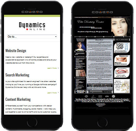
Mobile-friendly websites are tailored to provide a great user experience to individuals using smaller screens or tablets. Traditionally, websites have been in the range of 800 to 1200 pixels wide, which fits fine on a desktop computer with full-sized monitor. But smartphones are in the 3-400 pixel range and tablets 6-800 pixel range. So if the site is not “friendly,” it will shrink to fit its entire width on the smaller screen (as shown in the example above right).
As a result, viewers need to pinch-in, zoom out and scroll right and left to read your text and see your images. Clicking on menus and buttons is also a challenge.
Mobile Sites Rank Higher For Mobile Searches
Google started ranking mobile-friendly higher in its search results when the search is conducted from a mobile device. That makes complete sense given Google is interested in delivering the best possible user experience. In May, Google plans on rolling out another algorithm update that will provide even more ranking power to mobile friendly websites.
If you think that your customers or potential customers are looking for your business or service on mobile devices, now is the time to update your website.
How to Determine if Website Sessions Are From Mobile Users
The techniques for determining the percentage of visits to your website coming from a mobile device include:
- Script-based analytics, such as Google Analytics
- Log file analysis
Both of these allow you to look back a certain period of time and see the percentages of users from smartphones and tablets. In fact, you can find out the exact type of devices used. It is not uncommon to see a range of 10 to 40+ percent from a mobile device, depending the businesses.
Mobile-Friendly Solutions
A few years ago, developers came up with the idea of developing two separate sites, one for desktop and other for mobile. The mobile versions of the site had a fixed width that was much narrower. This worked, but created a burden for the publisher who then had to maintain two sets of page content and layouts.
But new browser technology called cascading style sheets and div layers enabled website developers to, in a way, separate the content and design such that the layout can change in response to the width of the browser.
This approach is called “responsive design.”
As a simple example, think of a web page that has three blocks of content arranged horizontally in one row. It looks fine on a desktop computer, but to fit them in a row across a smartphone screen will require a great deal of shrinking. In responsive design, the three blocks stack vertically, in a column, if the screen width is determined to be below a certain number of pixels. You can see this effect on a mobile-friendly site by changing the width of your web browser to make it narrower and wider.
View our short video below that demonstrates how responsive design changes the layout of a web page as a result of narrower or wider browser widths.
Another modification in responsive design is to turn a wide menu bar into a narrow drop-down list of menu items. Developers can also hide some page content to further simplify the layout, especially if that content is less relevant to mobile users.
The best way to see if your site is mobile friendly is to view it on a smartphone and tablet. Can you read the text and see the pictures without any pinching or scrolling?
You can also use websites that emulate mobile device viewing, such as Responsinator.com.
How to Make Your Website Mobile Friendly

There is no way around the fact the implementation of the web page structure needs to change. Older sites use a table grid that won’t allow the layout changes needed to reflow elements from rows to columns, for example.
For some sites that have a lot of custom programming, you may be able to retrofit a new page structure, but keep the site’s data structures and overall look intact. However, in most cases, becoming mobile friendly requires a redesign of the entire site. Dynamics Online used this approach when implementing a redesign for National Artcraft, a wholesale and consumer catalog distributor of craft, hobby and art supplies, and Plantscaping, a Cleveland-based company offering interior landscaping and plant services.
Many businesses use site redesign as an opportunity to also convert their site to a content management system, such as WordPress, which allows the use of design templates that are already mobile-friendly.
About Dynamics Online
Dynamics Online is a full service internet marketing agency that provides web design, search engine marketing, social media strategy and more. We can look at your current web site and help you to determine if you need improvements. Call us at (216) 292-4410 or contact Bruce via email.